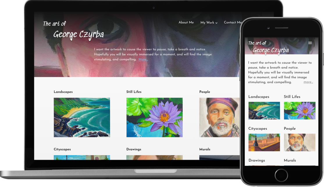
George needs to sell his vast stock of paintings that are piled up in his studio. Like many artists, George likes to create art, not market art. George needs a website - and a good amount of advice, encouragement and research into what makes people who buy original art click the “Check Out” button.
The first step, of course, was a client meeting to determine George’s needs and expectations.
Important findings:
Client assumptions:
Two of these assumptions would prove to be true and
one false. Only research would provide the answer.
This was two fold - competitor analysis and user interviews.
For this, I looked at large sites that sell original artwork for many diverse artists and the small sites of individual artists selling original paintings. To have an organized way to convey my findings to the client, I put my notes into a FigJam file.
The most salient details are:
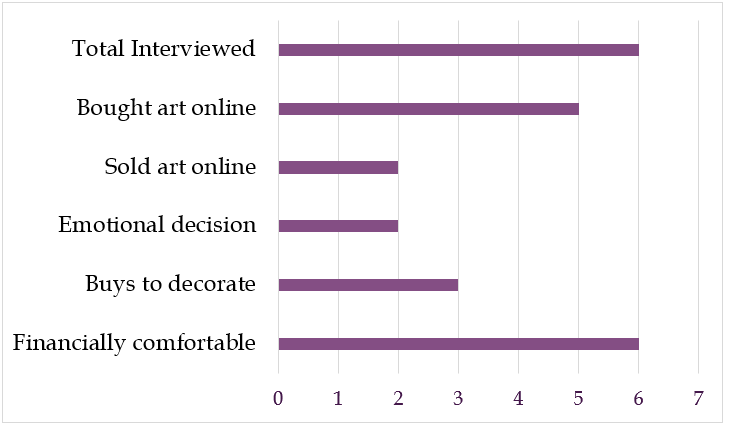
The interviewees fell fairly evenly between the ages of 30 and 70.
The information I wanted to know:

Notable patterns:
Going back to the client’s assumptions:
(My husband) buys more than I purchase… he
definitely buys, I would say, 95% more than I do.
Armed with the client’s needs and the research recommendations, I started with the information architecture, since every project needs a roadmap to arrive at the correct destination.
Body Copy
I chose Josefin Sans. It has enough visual interest, a good bold weight compared to regular weight, and has well formed numbers. It is also a bit more compact, which helps with the spacing for the painting descriptions.
Site Title
I looked for a font that would look interesting and artsy but be completely readable. Sedgwick Ave fulfilled these requirements wonderfully.
As per the client’s request, the colors are all subdued and grayed out. The colors are all pulled from the hero image to create a visually unified UI.
I asked George if he had a logo and he supplied me with his self portrait. Knowing my client, I knew that image was all I needed to set the correct tone for his work. I had my hero image and a source for all the colors I would use.

I was able to use the client’s actual artwork in these wireframes. After finalizing the design, I created the prototype.
Special Note
The Squarespace shopping cart and checkout cannot be modified. As a developer, I completely understand this because of the security involved in credit card transactions and dealing with personal data. However, as a design exercise, and to test the full task flow, I have included design of the checkout screens in the wireframes and prototype.
After creating an interactive Figma prototype to test the two task flows, I conducted usability testing with 5 people who had bought artwork online.
I had been communicating with George throughout the process, but we got together to discuss the final designs and user recommendations.
We discussed
The next step for me is to build a working site in Squarespace after the client makes some decisions that may impact the design.
I was surprised by how very distinct the two buying habits are, especially the Collectors. I thought that there would be more overlap in behavior. Decorators may act like Collectors on rare occasion, but not the other way around. The Collectors had more self confidence about their decisions to buy art that mirrors their personality. They never buy something to go with the couch. I think that they would rather buy a new couch to go with the artwork instead.
I also learned that the client's assumptions could be wrong, so it is important to verify them through research.
Enhanced event color coding feature for the native Samsung calendar app.
App where users can protect their health by easily finding the swimming water quality in an ocean, lake or river in the U.S.