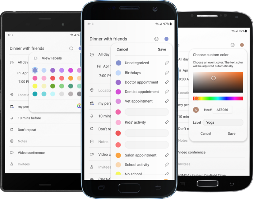
This is an exercise to add a feature to an existing product. Like most people anymore, my phone is like another appendage and I organize my life with it. I use the native Samsung calendar app for all my appointments. It is super clean, simple and efficient. However, there is one place where I get frustrated with it and that is in color coding events. There are twelve pre-selected colors to choose from, but I find that number to be too limiting.
The fix for my frustrations is a simple one of adding a custom color picker.
But is this the best solution? Is that enough? I looked for answers in the research.
I started with user interviews. Then, because there are so many calendar apps, I did competitor research on the calendar apps that were most popular among the group.
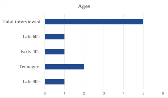
I talked to 5 people who use phone calendar apps regularly.
The information I wanted to know:
The teenagers:
The 30 - 40 year olds:
The late 60's year old:
Based on the research, it seemed that having expanded pre-selected colors was the best solution for some users and having a simple custom color picker was best for others. Therefore, it would be ideal to offer a choice of both solutions.
To get started, I copied screen prints of the app into Figma and recreated the screens that I would need. I tried to match icons with ones from Material Design, but where there was no match, I re-created the icon. Samsung has their own proprietary font, but Roboto was a good substitute.
The Samsung calendar app has a very simple and stark style. There are very few colors and most elements are shades of gray. There are no images except for icons. Because of this, there would be virtually no difference between mid-fidelity and high-fidelity wireframes. Therefore, I decided to go right into adding the new feature in high-fidelity.
When adding the new feature, I used all the styles that were already established, such as the circles for the pre-selected color choices, the way a color shows as being selected and the way an entry looks on the monthly calendar view.
Within this framework, I added two more rows of pre-selected colors. I also updated the existing colors to create a nice tableau of hues and shades.
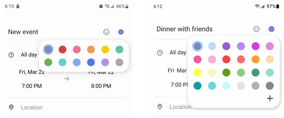
The plus sign indicates that there is more and opens the custom color picker. I kept this simple and easy to use. The new color is then added to the color choices.
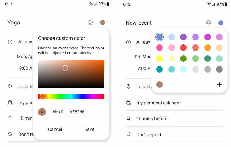
In setting up the prototype, I had two task flows that needed to be tested.
I tested the prototype with 5 people, 2 men and 3 women, of various ages, teens through 40s. There were only two issues that were brought up by the testers.
Replacing the plus sign with a rainbow icon was a super simple and fast fix to eliminate ambiguity.
Adding a way to label the colors was considerably more complicated. However, I had to agree with the testers that it would add a lot of value to the new feature.
Adding this functionality, felt like adding an additional feature and therefore would need to be tested as well.
The competing apps I researched didn’t handle color labels very well, if at all. Some calendars allow the creation of other calendars within them, but the Samsung calendar does not have this feature. It allows the user to import calendars from a Google calendar, but this is a time consuming approach since it involves opening and editing another app. Therefore, I spent some time brainstorming and trying to visualize a highly usable solution within the framework of the Samsung app.
On the existing pre-selected colors screen, I added a rainbow circle to indicate access to a custom color picker. I also added a link to view the colors in a vertical row with a field for adding or editing a label. Users who either don’t use labels or can remember often used colors, can use the uncluttered first screen for quick access. Those who need more details can go on to view the list.
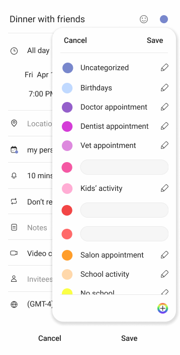
I was able to test the design with 3 more people.
What I learned from this project is to trust my instincts more. I had considered using a rainbow circle icon initially, but went with the plus sign because of the general minimalist and colorless native design of the app. I had also considered adding the label feature initially but felt like it was an additional feature added to the project to add one feature. However, with more colors to choose from it becomes more difficult for a user to remember what color is assigned to what type of event. Since they make the expanded colors more usable, the labels really are a part of the initial feature.
Responsive website to sell original artwork.
App where users can protect their health by easily finding the swimming water quality in an ocean, lake or river in the U.S.