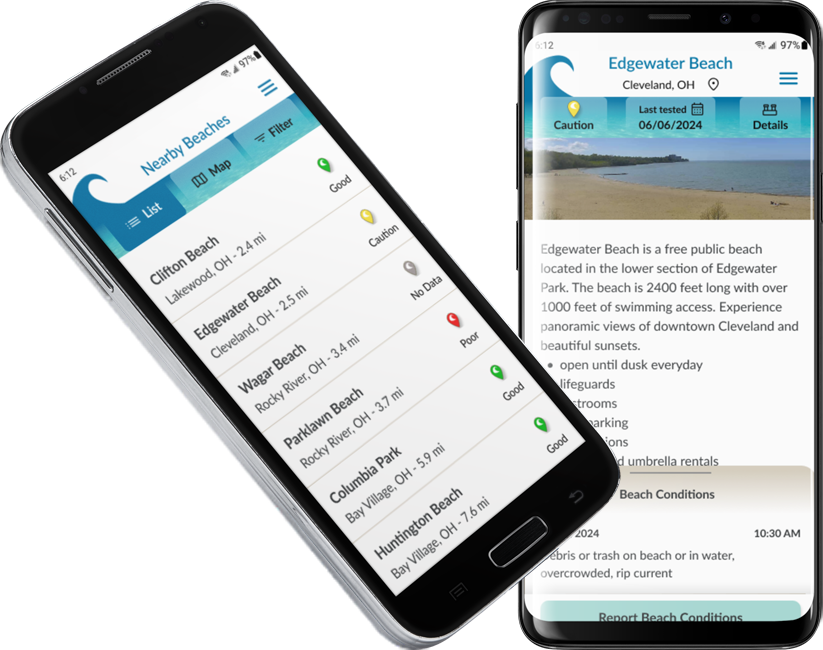
Due to environmental factors, the quality of the water in our oceans, lakes and rivers can be unsafe for people and pets to swim in. The bacteria levels can be too high or there can be other contaminants. In the U.S. there are many government agencies who test the water on a regular basis, but it can be difficult for the average person to find this information. Often people arrive at a beach only to find a sign posted that the water is unhealthy and they have to scrap their plans for the day. Worse yet, there may be no sign posted and they might swim in dangerously unhealthy water.
It would be great to have an app that would take the published testing information and present it in an easy to find and understand format. Users would be able to look up beaches they may want to go to before they leave the house. They wouldn’t have to waste time going to a closed beach, or endanger their health swimming in contaminated water.
In addition, since the quality of the water is only one part of a great beach going experience, the app would have a feature where users can report conditions that may negatively impact a visit. It would act like the Google Maps reporting feature, but instead of accidents or speed traps, users would choose from a list of items and report things like trash on the beach or jellyfish swarms. Each entry would be date and time stamped, so that beach goers can know that a condition reported in the morning might not be valid by the afternoon or evening.
I started with competitor research to see if there are any apps available that are providing the same information. I found several for either specific areas of the U.S. or other countries.
Most Apps List:
There was really only one app that would be direct competition, Swim Guide. Swim Guide was created by a Canadian group and covers Canada, Australia, New Zealand and the U.S. There are things they do well and things that could be better. The biggest problem is the lack of current data on the app for many beaches in the U.S.
Of course, I know what I would like to see, but I needed to talk to potential users.
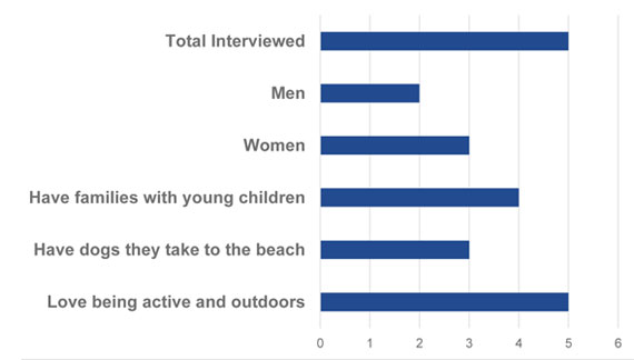
I interviewed 5 people who regularly swim in an ocean, Great Lake or large river. They were between the ages of mid 20s to mid 50s.
The information I wanted to know:

Notable patterns:
We got all the way to Maumee State Park, and there
were signs saying, "don't go in the water." It was
green. It was emerald green. It was a color that was picturesque, but not the kind of thing you really
want to go swimming in.
The users didn't fall into distinct personas, but rather shared many characteristics. Rather than a distinct person, I created a user family.
The notable points are:
After reviewing all the research I came up with a Feature Roadmap for an MVP.
The minimum is:
There were a lot of ideas, but H2know was by far the best.
The logo needed to evoke water - but swimming water and not drinking water. It seemed that a wave would be a good symbol for natural bodies of water. I drew some sketches and a few variations on a stylized wave, ultimately choosing a version that was simple and clean.
The font needs to be readable while being somewhat compact to fit more in a small space. I chose Lato since it has a narrower set width than some other san-serif fonts while still having an open feel.
The colors should evoke very clean water and sandy beaches. I looked for some photos of tropical waters with good visibility to the sandy ocean floor. From this, I chose some variations on turquoise and beige.
The main body font color is a dark, bluish gray which might be found in underwater rocks.
These are the screens with the styles and images applied. I modified the onboarding from the mid fidelity wireframes.
Onboarding
Onboarding was a bit of a struggle. My research said that there is a tremendously high rate of app abandonment and that onboarding helps with this. However, getting a balance of offering enough instruction but not too much is tricky. Ultimately, in the high fidelity wireframes, I created a series of four modals which offer the bare minimum of information to get a user started. I put fuller instructions into a user manual accessible from the menu.
After making any necessary modifications to the high fidelity wireframes, I created an interactive prototype for usability testing.
Instructions to complete the testing:
Once on the details page:
The user's guide can be viewed anytime through the menu.
I did usability testing with 6 people, 4 women and 2 men, ranging in ages between 18 and 56. I spent about 30 minutes with each person.
They were evenly divided between frequent beach goers and occasional beach goers and I found some differences between the two groups in what was important to them.
In general the frequent beach goers were very enthusiastic about the app, delved into the reporting and information presented and understood the mission of the app right away.
Testing with less frequent beach goers was helpful to see where the functionality could be better and to root out elements that were not so intuitive.
All of the more severe problems got fixed for the final prototype.
It would be great to bring this app into reality. The app would be supported by advertising, with a possibility of an ad-free subscription option at some point. There would have to be enough adoption and use to generate the ad revenue and to make the user reported conditions something useful.
This would all hinge on the data being timely and correct. The testing data is out there, but getting it into the app in a timely, cost efficient manner might be an overwhelming task. The nearest competitor, Swim Guide, doesn’t manage to do it, so the feasibility of this would have to be investigated before going any further.
I was surprised at the difference in opinions when testing with people who the app is designed for versus people who would have no need of it. Although there was valuable input from both types, it was a little frustrating, and time consuming, trying to explain some of the concepts to people who would never use an app like this.
Responsive website to sell original artwork.
Enhanced event color coding feature for the native Samsung calendar app.